Tag Archives: dell

The best worst keyboard

A Dell QuietKey keyboard from roughly 2010.

The Dell 0T347F QuietKey Keyboard — The Best Worst Keyboard

It’s a fine morning in 2010. I’m sitting in one of the tutorial rooms at uni, in a computer lab setup with rows of computers for students to use. The desk is terribly setup; the screen sits on top of the computer, which takes up so much depth on the desk that there’s basically only room for the keyboard in front of the computer and absolutely nothing else. Even the keyboard is almost hanging off the front edge of the desk. Ergonomics weren’t a thing in those days, it seems, but this was par for the course in this kind of ancient history.

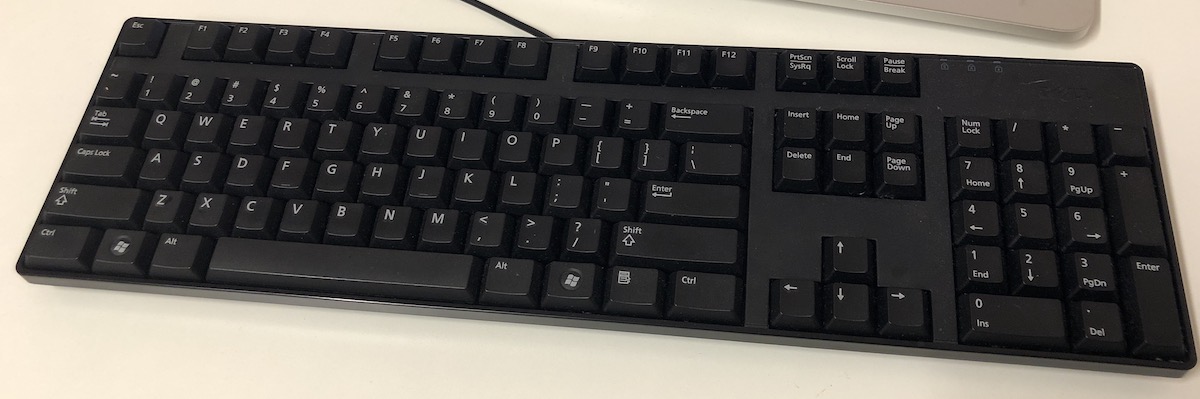
Strangely, the keyboard grabs my attention. It’s a standard Dell keyboard, the kind that comes free with your new Dell computer and if you don’t know any better, the one that you start using with your new Dell computer. It feels surprisingly good to type on. It’s not mechanical, but the half-height keys are responsive in a way that I wouldn’t expect from an OEM keyboard – certainly not any OEM keyboard I’ve used up until that point, not even the white plastic Apple keyboards I used back in high school. The keys don’t have the same solid action or tactile bump that mechanical ones do, but they still feel great to type on, with a bouncy springiness that puts the typing experience leaps and bounds ahead of the lethargic key feel of any other rubber-domed keyboard of its time.

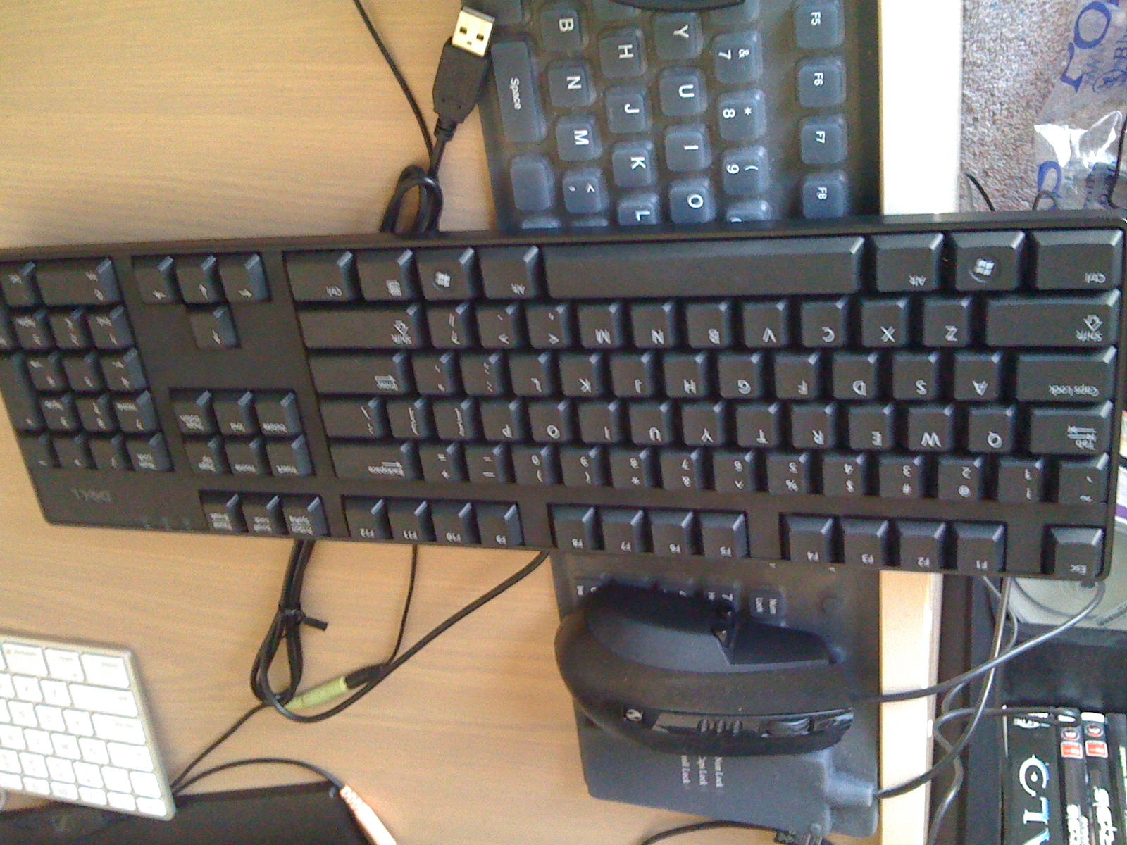
I like the keyboard so much that I end up buying one for the princely sum of $22, or about $30 in today’s money. It’s the cheap and cheerful nature of it that appeals to my frugal sensibilities, back in the days where I was a poor uni student that didn’t have a hundred dollars to spend on a mechanical keyboard, much less two hundred. I don’t end up using it as my daily driver keyboard — that privilege is reserved for the aluminium Apple keyboards of the time, but it’s far better than the rubberised, spill-proof, roll-up keyboard I’m using for my gaming PC at the time, as evidenced by this blurry photo.

The best worst keyboard with my two other keyboards of the time

I’ve had a bit of a storied keyboard history. On the one hand, I’ve been using a mechanical keyboard since about May 2012 or so, with the Das Keyboard being my very first mechanical keyboard. Before that, my setups often featured the standard Apple keyboard, with its instantly recognisable, if divisive, low profile, laptop-style chiclet keys. When I started my first corporate job and had my own desk, I specifically went and purchased a nice mechanical keyboard with macro buttons and RGB so I could have an excellent typing experience at work. That’s not really a thing these days, thanks to workplaces moving to mostly hotdesks in light of Covid and people appreciating the flexibility of working from home, but you can still do it if you’re willing to lug around a keyboard with you, or keep it in a locker or something at work. As much as I enjoy using nice mechanical keyboards, I’ve used plenty of less-than-stellar keyboards as well. There are photos of me with those rubberised, roll-up keyboards at LANs, where all I needed was something that made it possible to WASD around, no matter how mushy it felt, or how awful it was for any typing.

These days, my setup is generally two keyboards on my desk. The further back keyboard is currently a CODE Keyboard which is always connected to my Mac, while the keyboard directly in front of it is whatever keyboard I’m using with my gaming PC. For the last few years, that’s been a Corsair mechanical gaming keyboard with Cherry Red switches. This setup works pretty well. I don’t do that much typing on my Mac anymore, at least nothing like I used to do, but when I do need to type out the odd phrase, sentence, or even paragraph, the CODE Keyboard with its Cherry Green switches provides such a sublime typing experience that I find myself wishing I did. And when I’m in leisure mode and carrying games with Muerta in Dota 2, it’s nice to have a keyboard that I know I can rely on to give me the exact keys that I press, safe in the knowledge that if I accidentally hit a key, or fat-finger a skill in a teamfight, that’s on me.

Unless my keys flat-out doesn’t work, of course.

Continue Reading →

What I don’t like about the Dell Venue Pro

Selling off my HTC 7 Mozart and going back to my loaner Venue Pro (portrait WP7 slider) made me finally realise why I don’t like it: it has a curved screen.

The curve on the Venue Pro is convex, meaning that it’s got a very slight bulge outwards; exactly the opposite of what you really want on a display. When the iPhone 4 came out, many tech pundits harped on about how the glass on top of the display was fused to the LCD underneath, and how that made the content appear that much closer to your finger whenever you touched it.

The Venue Pro is the opposite; the horizontally-convex (that is, bulged outwards in the middle and less so at each side) display means that content feels further away from your fingertips, which makes for a weird touchscreen experience. On a display that already feels sub-par, it’s exactly what you do not want.

Anyway.

Heaps of posts upcoming. There’s something special coming up very, very, soon, and then there’s the big ol’ MicroServer write-up I might do, oh, and a HP TouchPad review-slash-webOS extravaganza somewhere in the middle. I wouldn’t expect the TouchPad review until early October, and the MicroServer sometime after that. Uni will get really busy really soon, and doubly so for me, procrastinator extraordinaire.

Smartphone Lust

As someone who is interested in technology, there are few things that make me happier than a shiny new toy to play with. Unfortunately this also means my bank balance is relatively bare most of the time, but what money I save from not driving, smoking, drinking or, uh, courting means more money to be spent on new shiny, and that’s a-ok by me. Isn’t disposable income great?

For the moment, smartphones are where it’s at. Perhaps I just haven’t caught up to the rest of the world when it comes to tablets, or perhaps I think they’re not quite there yet – either way, my interest (for the moment) likes solely with the likes of those smartphone manufacturers like HTC, Motorola, Samsung, yes, even Apple and HP/Palm.

My personal interest in technology means that I have an iPhone 4 as my daily carry. In the past, I’ve experimented with a HTC Desire running Android 2.1.

This time around, I’m currently playing with the Windows Phone 7 platform, and not one, but two phones — the Dell Venue Pro and the HTC Mozart 7.

The Venue Pro is kinda weird. It’s my first 4-inch smartphone, and while the extra screen space is kinda nice, the phone itself is pretty heavy and quite bulky (especially compared to the chic Mozart). It’s also a portrait slider, which makes it even more unique. The AMOLED screen is nice and vibrant, as expected, but there’s one thing I can’t quite put my finger on that I don’t like about it. I think the display is too far inset from the glass, maybe. The glass that it uses is the famed Gorilla Glass, but it’s not the same as the same Gorilla Glass-touting Mozart. Not sure if it’s an issue with my phone or what, but I find it has moisture issues — like it’s more slippery than it’s supposed to be on the surface. The sleep/wake button is difficult to press, but overall, it’s a okay-ish phone. Average, I would say.

The Mozart 7 is a different story. It’s slim, light, and is everything I would expect from HTC. It’s a shame the notification LED isn’t used for any Windows Phone notifications (I’m not sure that’s actually a feature that WP7 offers), but it’s very, very nice. The phone itself is very responsive, the included HTC ringtones are even nice (Harp Glitch is my current ringtone of choice — WP7 doesn’t offer custom ringtones), and perhaps the only complaint I have is about the capacitive buttons — they’re a little too easy to hit. Apart from that, no complaints.

I’ve been using the Mozart as my daily carry for close to a month now, and I’ll have some thoughts on Windows Phone 7 up shortly (week, perhaps two, perhaps three if I’m lazy), as well as a nice comparison between the two phones.

For now, I’ll just say that Windows Phone 7 is very nice (contrary to what you might have read). There’s consistency everywhere, things are nice and simplified, and it’s overall very polished. The apps aren’t quite there yet, but that’s a story for another time.

Dell SP2309W — 2048×1152 what now?

I spose the iphone4 would be a good subjective test of screen tech like this – Cramming relatively big res into tiny screens.

Er, no, no it wouldn’t.

Back story: there’s a pretty nice screen on that Dell makes. It’s the SP2309W, and for $279 you get a 23″ TFT Dell monitor that does 2048×1152, higher than high definition (but still at a ratio of 16:9).

I pointed out this monitor to a couple of my friends, and one made the comment you see above (along with something about a weird resolution for a computer monitor).

Before I continue I’d like to point out that most of this is a re-hash (albeit a pretty poor one) of Dustin Curtis’ thoughts on the issue — I’d suggest you go read his blog first, and then come back here when you’re done.

And that’s exactly where he’s wrong. It’s not like the iPhone 4, because while the iPhone 4 crams a relatively big res into a smallish screen, it does so in a way that doesn’t affect the size of on-screen elements.

Traditionally, what happens is that as pixel density gets higher, user interface elements get smaller. It’s got something to do with how large any specific UI element actually is, and how text has been traditionally rendered.

Over at his blog, Dustin explains:

This means that if you draw the letter “a” in 12pt Helvetica on any screen, it will take up exactly 8×9 pixels (almost all the time). As you increase the number of pixels on the whole display, the number of pixels that it takes to draw the letter “a” in 12pt Helvetica stays the same, the letter just becomes smaller.

More pixels crammed into a smaller space (that is, a higher pixel density), results in things becoming smaller. If you think about it, it makes sense — say you’ve got an image that’s 512×512, the size of an typical Mac OSX application icon. If your screen displays that at, say, 100ppi, it’ll appear to have certain dimensions on the screen if you chose to measure it with a ruler. Measure that same icon on a 130ppi screen, and it’ll appear smaller. Not because it’s lost any pixels, but because those same pixels have been jammed into a smaller space.

Then you hit the iPhone 4. It’s not quite resolution independence*, but what Apple have done works pretty well. Instead of using the same graphics resources as the iPhone 2G/3G/3GS, developers are encouraged to develop “retina-optimised” graphics — that is, graphics at double the resolution of their previous-generation iPhone counterparts. Why? Because such graphics will increase interface definition.

If you take that same icon that we had in above example, and instead of just scaling it up or down to suit different resolutions, what you can actually do is create a whole new version of that icon so that it displays at the same physical size — regardless of which screen you display it on. Obviously the icon will look vastly improved on a higher resolution display compared to the lower resolution one, but that’s only because we’re increasing image density alongside pixel density.

Dustin, again, sums it up best:

This means that when iOS scales the elements in physical size to fit the 3.5-inch iPhone 4 screen, they take up the same amount of space as the elements drawn on the iPhone 3GS but they use four times the number of pixels.

Four times the number of pixels, represented in the same physical space = incredible user interface definition.

If that’s not mind-blowingly awesome, I’m not sure what is.

The whole “retina display” mentality of the iPhone is not about representing more things in the same space —  it’s about showing the same stuff, just at a better quality. Contrast this to the display above — because whatever you use on that display (Windows, or Mac) isn’t resolution independent (Mac OSX is to a degree), things will appear smaller, and that’s just how the cookie crumbles.

* okay, it’s not resolution independence at all. Without getting too technical, Apple are actually using two sets of graphics resources for everything — apparently they found that ahead-of-time resolution independence offered the greatest performance/resource benefit. More reading available here on the matter (thanks, Bjango!).