Tag Archives: ios

Selective photo permissions in iOS sucks, actually

A couple of years ago, Apple introduced the idea of selective Photos access. The idea was so that if you let an app have access to specific photos, then the app couldn’t do something like steal all your photo metadata straight out of your camera roll, including location. Great for apps that you didn’t necessarily trust to abuse that access, given that there’s was no way for you to tell if an app had collected all the metadata from all your photos and uploaded it into a database somewhere.

Apple’s solution, introduced with iOS 14 in 2020, was to allow you to select which photos an app has access to, which sounds great in theory, but has become a bit of a usability nightmare.

The problem is that by only selectively allowing an app to access your photos, you’re effectively choosing between two, kinda sucky options.

If you selectively allow access to photos, it means that every time you want to share a new photo to the app, you have to take the photo (using whatever camera app you want, whether that’s the stock camera or something like Halide), jump into the app, hope it has a deep link to the Settings page that allows you to change which photos it has access to (not all apps do, and the implementation to select photos can differ between apps), select the new photos that you just took, and then finally send them using the app. This three-step dance of taking, selecting, and sending happens every single time you want to send a photo using an app that only has selective access to your photos, which adds a huge amount of friction to a process that should be as few steps as possible.

But what’s the alternative?

The other way you can get around this taking/selecting/sending process is by using whatever app you’re sending the photos with, to take the photos with in the first place. Most apps have an integrated camera option that allows you to take a new photo right from within the app, then send that directly. And while this is a much simpler, more streamlined process than the snap-select-send dance, it comes with its own caveats. Firstly, there’s no guarantee that these photos taken directly within apps will be saved to your camera roll by default. While some apps offer to save taken photos to your camera roll automatically, apps like Snapchat make you tap a button before the photo you’ve taken is saved to your camera roll. But when you do, these photos taken from within apps seem to miss out on some normal photo metadata, like camera/lens info, exposure, focal length, location, and they don’t seem to be able to be Live Photos or be recorded in different image formats, either.

Screenshot of two comparison photos, taken using the Steam Chat app on the left, and using the stock camera on the right.

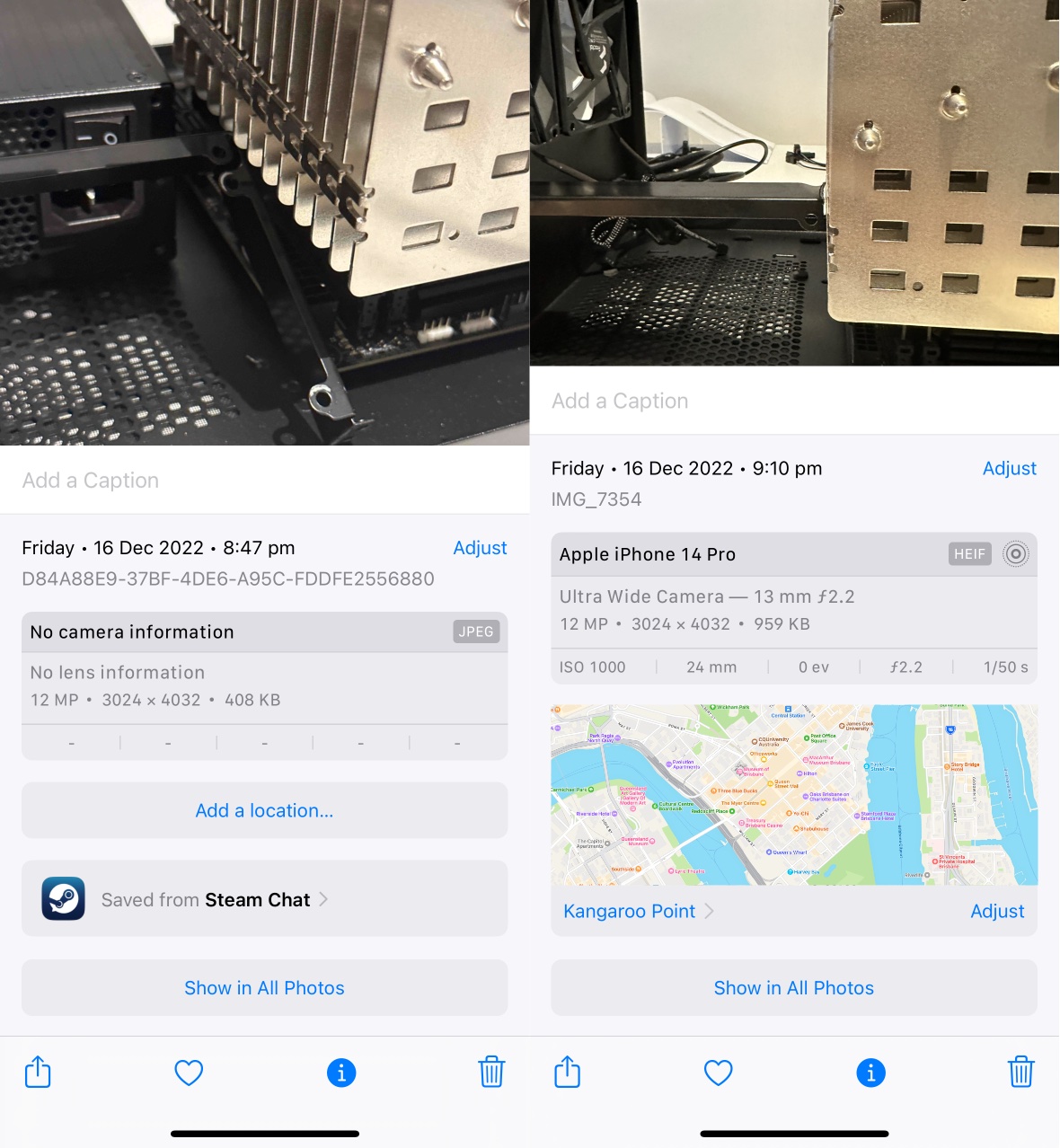
Note differences in metadata between these two photos. Photo on the right taken using the Steam Chat app on the left, and using the stock camera on the right.

Without looking too closely at the technical details, photos taken within apps might also be missing out on some of the technical features afforded to the stock camera app, like being able to automatically switch to the ultra wide lens for the macro mode on recent Pro-model iPhones, for example, nor do you seem to get access to the camera modes and effects of the stock camera app. This means your photos when taken using apps aren’t necessarily going to be the same as ones when you take them using the stock camera app. All of this is still probably fine, if all you’re doing is taking photos for the purposes of sharing to others, but you might miss that data months or years later. There does seem to be exceptions to this, as clearly third party camera apps like Halide can capture in different formats, but I think Live Photos are a stock camera app exclusive.

So when you want to share a photo to an app that doesn’t have access to your entire location history from all the photos in your camera roll, you can either:
– do a snap-select-send dance every time you want to send a new photo using that app, keeping your photo metadata intact and ensuring the best possible photos
– take and send the photo directly from within the app, which is a much more simplified process, but results in photos with no metadata and other features that you might want later, like Live Photos, and maybe even things like depth information.

And obviously, this is only for photos. For screenshots, the situation is even worse, and you have to do the snap-select-send dance every time.

What’s the fix?

Unless I’m overlooking something here, isn’t it as simple as letting apps only access photos taken in the past one or two hours? If you’re sending a photo that you just took, it seems unlikely that you would be doing it more than say two hours after it was taken, and while a higher number would give more leeway for this, I’d be concerned about an app having a rolling 12 or 24 hour access to your photos, because then we’d just end up with the same problem that we had originally if apps have access to all your photos, but one or two hours hopefully means that apps you haven’t recently used, won’t be able to take a rolling 1-2 hour peek at your photos.

Maybe the better solution is to prevent apps from having access to photos metadata in the first place. Then none of this would be an issue, and we could go back to the time when apps had access to all photos, all the time. Selective photos metadata might not be technically possible, but that would be the ideal.

My iPhone 11 Pro Home Screen

It’s been three long years since I last had a new iPhone. While my iPhone 11 Pro remains a best-in-class smartphone that would undoubtedly serve me well for at least another couple of years, it’s time to move on.

But before we can do that, I kind of need to break down the apps that are currently on my iPhone 11 Pro home screen. For posterity’s sake, if nothing else, but mainly so I can look back on this one day and reflect fondly on the interfaces and design paradigms of the era, for a time in the not-too-distant future when we’re all using augmented reality interfaces.

I’m writing most of this while waiting for the delivery of my iPhone 14 Pro. I should have had it delivered to work and had someone else sign for it, because the worst part of having it delivered to your home address is needing to be listening intently for a knock at your door, or if you live in an apartment building like I do, the ringing of your wall phone to indicate someone has called your apartment from the outside. Now I’m stuck here at 6pm like some kind of hostage, waiting for a delivery that would ordinarily, on any other day, have been here already. But maybe there’s lots of iPhones on the StarTrack truck today, so the deliveries are taking a little longer than normal.1

In the future I think if I’m not getting my iPhone delivered to work, I’ll probably pre-order it for in-store pickup. If I take the day off work I can take it slow, pick it up from the store first thing in the morning, and then spend the rest of the day transferring all my stuff. Maybe taking the single day of annual leave is worth it.

It’s been a long time since my last iPhone home screen post. The iPhone X launched in 2017 to much fanfare because it was the biggest change to the iPhone silhouette in the entire history of the iPhone. The distinctive top and bottom bezels were gone, replaced by an almost uninterrupted edge-to-edge display that had a small notch at the top. The home button that had long contained a fingerprint Touch ID sensor was replaced with an upgraded front-facing camera system and biometric unlocking system called Face ID, which shone a pattern of infrared LEDs into your face so you could be recognised by your phone. Combined with an all-new gesture-based navigation system and an OLED display with curved corners that touched every edge on the front of the device, it was the future of iPhones for years to come.

The iPhone 11 Pro wasn’t that much different to the iPhone X in terms of the screen. Apple added an ultra-wide camera to the back, and spec-bumped just about every spec they could across the board, and that was about it.

Which might be why, although my home screen looks a little different, my apps stayed more or less the same.

Once upon a time choosing what apps to put on your home screen was a challenge because there were so many apps and only a 5×4 grid to put them in. There might be more and better quality apps now, but because we have folders and search, deliberately choosing which apps go on your Home Screen, versus those that are relegated to a folder, or worse, the App Library, remains as much of a challenge now as it was then, even if it’s for different reasons.

I’m still using a modified CGP Grey home screen organisation method, although the only tenet I choose to adhere to is “only one page of apps”. With some mental gymnastics I can claim to have a free row, although I definitely have four apps in my dock. The dock’s real estate is too important not to, but for big screen phone reasons, not because it’s the one row that stays static over multiple pages of apps, because the latter isn’t something that I have to consider when I only have one page of apps anyway.

Speaking of which, let’s get into the apps.

Continue Reading →

My iPhone X Home Screen

It’s 6am. A frankly unbelievable hour. Nevertheless, I’ve caught the earliest bus I can tolerate, all in the hopes I’ll be able to pick up an iPhone X from one of the three Apple stores in the greater Brisbane region. I’ve chosen Chermside as my go-to — hopefully it’s a little less busy because it’s a little more out of the way, even though the Brisbane CBD store is easier to get to.

It’s not that I forgot to pre-order the iPhone X, it’s just that I wasn’t sure I wanted one. I wasn’t sure then, and I’m still not sure I want one now. But I might as well try. By the time I arrive at Chermside, the queue is maybe 40-something deep. The Westfield is eerily quiet at this time of the morning, but it’s nice. Peaceful, even.

I end up lining up for the iPhone X. It’s the second time I’ve ever lined up for any iPhone. I put in a reservation with the Apple blue shirts when they start working their way through the queue at around 7am, who congratulate me on my new iPhone once we’re finished choosing. The store opens at 8am, but it’s still about another hour after that I get to purchase my iPhone X. Was it worth it? Absolutely.

You probably saw where this was going when I started writing about my iPhone 6 and 7 home screens, years after those devices were released. I thought we needed some kind of catch-up before getting to today’s iPhone X home screen.

Given that it’s only been a year since the iPhone 7 was released, not much on my home screen has changed. I’m still using a home screen organisation method that’s similar to the CGP Grey method, and only a few apps have been swapped out.

Starting from the top:

  • Notesy has been switched out for Editorial, as the former has been removed from the App Store. They’re both pretty similar apps, even if Editorial has a bunch of powerful workflow-type actions that I’ll probably never use.

  • Slack was relegated to a folder after I discovered I wasn’t using it as much as I wanted to be, and Soulver makes a return to the home screen in its place.

  • Vesper was also removed from the App Store and my home screen. I’ve got Yammer in its place, because I’m now a corporate drone and a slave to the man.

  • WhatsApp was moved to a folder because I hardly use that either, and the Discourse app lets me check AppleTalk without having to load up Safari, even if it is just a glorified web wrapper.

  • Ecoute was moved into a folder because it’s hard to beat the inbuilt Music app when I’m an Apple Music subscriber. To be fair, Ecoute still works with iCloud Music Library, but the built-in Music app has Apple Music integrations that aren’t available on third party apps. I’m also using a manual playlist for the “play all music from playlists within a folder” problem that I described as one of my main reasons for using something other than Music originally.

  • Tootdon is on my home screen at the moment because I’m trying out Mastodon as an alternative to Twitter. Mastodon feels a lot like App.Net right now, but we’ll see how it all pans out.

It’s been two weeks since the release of the iPhone X, and so far, Gmail, Google Maps, Clear, Editorial, Soulver, and Discourse don’t support the larger iPhone X screen. I’m kind of surprised Google’s apps aren’t updated, I can understand why Clear hasn’t (they’re apparently working on a complete overhaul, but the app was very custom to begin with), but apps like Editorial, Soulver, and Discourse are a little behind. Discourse is particularly puzzling, given that it looks like just a super-barebones web wrapper that you wouldn’t think has much custom code.

But there’s another problem with the iPhone X that’s just as important as non-optimised apps: it’s almost impossible to find great wallpapers for it. Even if you do manage to find something with the right resolution and the right aspect ratio, the quality of the screen means you’ll quickly notice any imperfections. Thankfully, a few recent Samsung devices (the S8, S8+, Note 8, and slightly older Note 4) all have displays with similar aspect ratios. If you can tolerate a slightly zoomed wallpaper, then there’s a whole range of 2560×1440 wallpapers that you can find. I’ve also been using Vellum.

My iPhone 7 Home Screen

For the first time since the iPhone 4 was released, the iPhone 7 introduced no changes to screen size over the previous model (notwithstanding S-revisions). But sometime during the two years of the iPhone 6 and the iPhone 7, I switched to some variation of the CGP Grey method of home screen organisation, once again covered by Ben Brooks. There’s now just one page of apps, at least one row that has no apps at all, and four icons in the dock. Everything else goes in one of the folders.

The advantages of this method of home screen organisation make a lot of sense. The days of having pages and pages of apps were over since Apple introduced folders, and this takes that idea to the next level. No longer do you have to rely on muscle memory to remember which apps are where, and instead, you can rely on Spotlight to find the app you’re looking for. Letting go of any inclination to organise those top-row folders is also incredibly freeing.

Your most-used apps can still remain on your home screen, and with iOS 9 and the introduction of Spotlight suggestions, sometimes you don’t even have to search for the app you want, as it appears in your Spotlight app suggestions. If you’re thinking of adopting this method, I’d highly recommending hit “show more” within Spotlight to show eight app suggestions instead of the default four.

Unfortunately, this requirement for some folders and just one page of apps meant that I had to make some decisions about how many individual apps I had on my home screen. Thankfully, changes to usage patterns made that a little easier. This is going to get a little lengthy, but stick with me.

Let’s talk about what was removed, to start off with. If I was going to keep one of the Camera or Photos apps around, it was going to be Camera, as I could always access Photos from within Camera. The argument could also be made for removing Cameras, as you have shortcuts to it from the lock screen and Control Center, but I still wanted it on my home screen too. With a folder dedicated to games, off went Threes. Passbook, Facebook, and Wikipedia also went — not that I don’t find those apps useful, but I found I wasn’t using them enough to justify a now-scarce spot on my home screen. Once I realised I hardly used the App Store app for finding new apps or basically anything at all, that was also moved into a folder.

Pocket Weather Australia was moved into a folder, which initially proved to be a bit of a dilemma thanks to the fact that the CGP Grey method doesn’t work well with folder badges. Folders only have one badge that is the sum of all the badges on apps within it, and because I use Pocket Weather’s badge to tell me about the current “feels like” temperature, I had to turn off notification badges for every other app in the same folder. As it turns out, none of the apps in there have badges I care about anyway, so off went that switch.

Boxie fell victim to “internal team issues”, which meant that development ceased and the app was removed from the App Store and my home screen not too long after.

Exactly seven apps remain unchanged from my previous iPhone. Fantastical, Clear, Notesy, Instapaper, Vesper, Swarm, and Tweetbot remain the staples of my third-party iOS experience, all representing the best-in-class versions of their respective App Store categories. Tweetbot 4 had only recently been released, which is why I was running it in tandem with the old version until I had a chance to do something about my numerous written, but not tweeted, drafts.

Now, changes.

It was during the period between iPhones that I started a new job in a new city, which meant a work email account. Not wanting to cross the streams, I decided to ditch Mail in favour of Gmail for my personal email. This turned out to be a pretty good choice, as I gained push email and smarter notifications at the cost of not using the built-in mail client. Living in a new city also meant I needed the most accurate data possible for Maps, which meant swapping out Apple’s aesthetically-pleasing maps app in favour of Google’s more accurate one. The jury’s still out on which one I prefer.

Sick of Apple’s unending changes to the Music app which removed features I used, I was trialling Ecoute and Cesium as potential replacements for the default Music app. At the time this screenshot was taken, I had settled on Ecoute as I liked how it created a playlist from a folder of playlists containing all the songs within the folder.

Additions to the home screen this time around include:

  • 1Password — I think I added this because I wanted to focus more on using strong, unique passwords for online accounts. Owning multiple computers meant I was logging into those accounts multiple times, and because I haven’t ponied up for 1Password on multiple platforms, the iOS version is the next best thing as my iPhone is always with me. Which is a good thing, as the 1Password iOS app is great.

  • Slack — I’m not sure why this app is on my home screen. I’m a member of exactly one workspace, which hasn’t had a message in any of its channels in months. I could easily swap this out with something else, but for now, I enjoy the nerd cred that I get from having it there (even if I’m the only one that knows about it).

  • NextThere — A new city meant new, real-time public transport options, and that meant NextThere. No other public transport app comes close to the everyday convenience offered by NextThere when it comes to knowing the next train or bus departing from your closest station or bus stop. And besides, who doesn’t want a smiling bus on the their home screen?

  • Outlook — This is for work email only, although I’d prefer using it for Exchange and Office 365 email over the built-in Mail app. Something about a first-party app just makes me feel more comfortable about the reliability of the thing, you know?

  • WhatsApp — My permanent WhatsApp status says “I begrudgingly use WhatsApp. Please don’t message me here unless you really have to.” I really have no idea why this was on my home screen at the time of this screenshot.

  • Copied — With the demise of the iOS version of Pastebot and no replacement on the horizon, I wanted something capable of doing some iOS clipboard management. The need is largely negated now that iOS and macOS talk to each other and I can copy stuff between both operating systems, but having an on-device clipboard manager has still come in handy on occasions, especially when I’m trying to copy and paste between my iPhone and iPad.

The folders themselves are self-explanatory. I could delete most of the Apple apps now that that’s a thing you can do as of iOS 10, but I keep them around. There’s a bunch of apps in the Tools folder that I rarely touch, and even more apps within Rares that I use maybe a handful of times per year. Games tends to get a few new additions here and there, but for the most part that stays pretty static too.

The eagle-eyed among you will note that I’m not sticking completely to the CGP Grey method of home screen app organisation, because there’s three apps in the row that’s supposed to kept free. I’ve been using that row as a trialling ground of sorts — some apps stay there temporarily to encourage use while I give them a red hot go, and from there they’ll either get promoted to a folder, or if they’re particularly good, a coveted spot on the home screen.

And if they’re not that good, then it’s the little X for them.

My iPhone 6 Home Screen

The last time I did one of these was back in 2013 not too long after the iPhone 5 was released, so we’re definitely long overdue for an update on my home screen. I think it’s interesting how this kind of thing changes over time, either because apps stop getting updated, better alternatives come along, or my own usage patterns change. Either way, let’s get into the nitty gritty.

I don’t have a definitive screenshot of my very first iPhone 6 Home screen, but I think is the closest thing, and it’s certainly the only home screen screenshot from just after the iPhone 6 release back in September 2014. As you can see, not that much has changed from the iPhone 5 home screen: besides adding another row of apps, introducing a whole new dilemma for home screen icon organisation, I’m more or less using the same apps.

Old favourites Fantastical, Clear, Facebook, Boxie, Instapaper, Soulver, Notesy, Vesper, and Pocket Weather Australia all make a return, and Tweetbot retains its coveted number-one spot on the dock. This being a year after the introduction of iOS 7, most apps and their icons have made the jump to feature the divisive flat design.

Changes to apps between my iPhone 5 and iPhone 6 include swapping out the much-loved, but unfortunately no longer updated Articles for the surprisingly great official Wikipedia app, which has all the features I care about in a mobile Wikipedia interface. Following the developer joining Apple, Articles isn’t the first app that was abandoned, and it certainly won’t be the last to be swapped out for a more modern alternative.

The demise of App Dot Net also saw the removal of Felix from my home screen. A pity and a damn shame it’s no longer available in any shape or form, as I’d rate Felix in my top five iPhone apps of all time based on aesthetics and usability alone despite the fact it was tied to a promising, if ultimately doomed, social network.

Sometime in 2014, Foursquare decided to split its app into two. Foursquare became the app for place recommendations, while Swarm was the gamified version, the one you used to check into places and collect mayorships based on how many times you had been there recently. Because the mayorships and check-ins was the original reason I joined Foursquare, I decided to keep Swarm on my home screen. Foursquare was relegated to a folder.

Threes is the only game to feature on my home screen, but mostly because it’s perfect for the in-between moments that life sometimes gives you.

Note that I’m still using multiple pages of home screens, with single icons on the first home screen, some folders on the second, and mostly games on the third.

The iPad mini

iPad mini white

I have this weird thing where I’ll keep a tab open for days, weeks, even months, if there’s something even potentially interesting that I can’t deal with right now, but want to do something with eventually. Before you ask, yes, I have heard of bookmarks, but ask any nerd and they’ll tell you they do a similar thing with their browser tabs. It’s not uncommon to have umpteen tabs open at any one time — and of all the stuff I have backed up, I’d be pretty devastated if I lost all my tabs. I could potentially get them back, but that involves trawling through days, maybe even weeks of internet history.  When you visit as many websites as I do, it’s hard to tell what you had open as a tab and what you were merely browsing out of curiosity.

But I digress. I’ve had two tabs open for close to a year now, and as much as I’ve wanted to write something substantial about the iPad mini, there just isn’t anything worth writing about. Not because the iPad mini is boring or anything, but because I just haven’t been inspired to write anything worth publishing. Because when it comes down to it, the iPad just isn’t as interesting as the HP TouchPad was, back in the day. WebOS was just so bad and so good at the same time, you know?

I’ve owned an iPad mini since it was first released around this time last year. It wasn’t my first tablet, but it is my first iPad. I honestly don’t have anything else to say about it that hasn’t been said elsewhere, but with the new iPad Air coming out riding on the coat tails of the iPad mini, I thought I’d take a moment to write about how I’ve been using it.

I think the most telling thing about the iPad is that it hasn’t replaced my computer. That’s telling because I see a lot of older, mature folk replace their clunky Dells with futuristic, touch-enabled iPads, even if they don’t run the same programs as their old computer used to. Why? I’m not sure, exactly, but at a guess, it has something to do with how intuitive Apple has made iOS (and then turned everything upside down with iOS 7, but that’s for another time).

But as much as I enjoy using the iPad, it hasn’t replaced my computer. If all I’m doing is light web browsing and catching up on my Instapaper backlog, then sure, I’ll pick up the iPad over the MacBook Pro any day; the iPad is lighter, has a much longer battery life, and lets me concentrate on one thing at a time, for the most part. It’s kind of like the Kindle, in that regard. For everything else, there’s the Mac: for switching between any of my umpteen open tabs, writing content into browser text boxes, and doing any other kind of serious work.

I tried writing one of the MacTalk daily news posts on my iPad mini one time, and while it was OK, the software keyboard really hindered the process by needing to switch between the various keyboards to access special characters. I could have worked around the issue by using a hardware keyboard or using an app that offered an extra row of characters, but that would have required a little extra preparation on my part, something I wasn’t able to do at the time.

Continue Reading →