I had an exam so I couldn’t really get up to watch the keynote, but I did watch it earlier today. Since I didn’t get to live-tweet it with a few of my best buddies, I put together a few random thoughts — there’s a great summary of the event over at MacTalk, written by Rémy Numa, but this just what I came up with while watched the keynote earlier today. In somewhat chronological order, but still mostly just Things I Would Have Tweeted If I Was Watching It Live…
Tag Archives: design
Form vs Function vs Intention
Some people give Apple a hard time about having a similar design language from Braun products from the 60s. The thing is, Apple isn’t simply copying visual cues from the past like Olympus or Pentax. Apple is taking what Dieter Rams has learned from Braun and implementing those philosophies into a modern product with a modern approach. Through this process, Apple is not only producing beautiful products but is also pushing the boundaries of materials, like aluminum and glass. Great artists steal. Stealing isn’t the same as copying. The OM-D’s equivalent in Apple’s world would be the next iMac looking like the first generation Bondi Blue iMac just for nostalgia sake.

via Coffee Time: Form vs Function vs Intention – journal – minimally minimal.
The actual article describes how the new Olympus OM-D pays homage to the humble OM from which it takes many of its design cues, but there’s a nice paragraph about Apple I just had to quote.
New Wallet!
I’ve been looking for a local distributor for Dynomighty Design wallets for a while now, and I’m glad to report I’ve finally found one.
Roughly four years ago, a couple of friends and discovered ThinkGeek. We were probably a little late on that particular bandwagon, but that’s okay. At the time getting items shipped from the US seemed like a particularly daunting task, so we decided to go in on a group buy – one of us would place the order and get the items shipped to that person’s house, and then the rest of us would pay that person back in cash. It kinda made sense as we’d save on shipping.
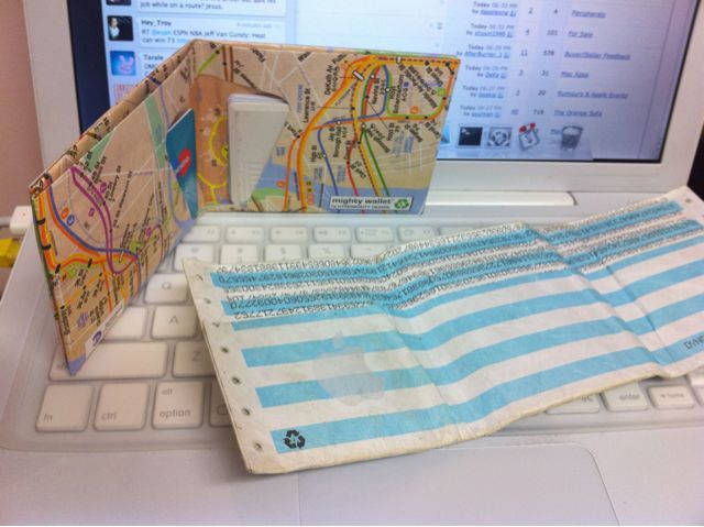
That very first order was pretty epic, to say the least; I’m not 100% on what I picked that first time around, but the total order amount came to over $400 AUD for the four of us. One of my items that very first order was a Dynomighty Design Dot Matrix wallet, as it greatly appealed to my inner-geek at the time. It was cool as was pretty much indestructible, and it had the number pi printed out in the ultra-cool dot matrix style.
It’s been a good four years. Many people have commented on how slim it is, even loaded up with receipts and cash/cards, and it’s pretty unique, too.
It was about time for a replacement though, and for a while I wasn’t even sure if I could get them in Australia without paying the exorbitant shipping rates from the Dynomighty website, or without going via ThinkGeek again. Looking into the matter a little more revealed that there were Australian distributors, but they charged quite a lot for the actual wallet, plus I then had to pay shipping.
To be honest I had completely forgotten about the issue until about two weeks ago, when one of the people I follow on Twitter tweeted about a cool little store in Elizabeth street, a cool little store called Syzygy. I went to Syzygy, and to my delight, their window display had a Dynomighty wallet on display! Well, that settled it – I just had to have one. Sadly they weren’t open that day, but I vowed to return.
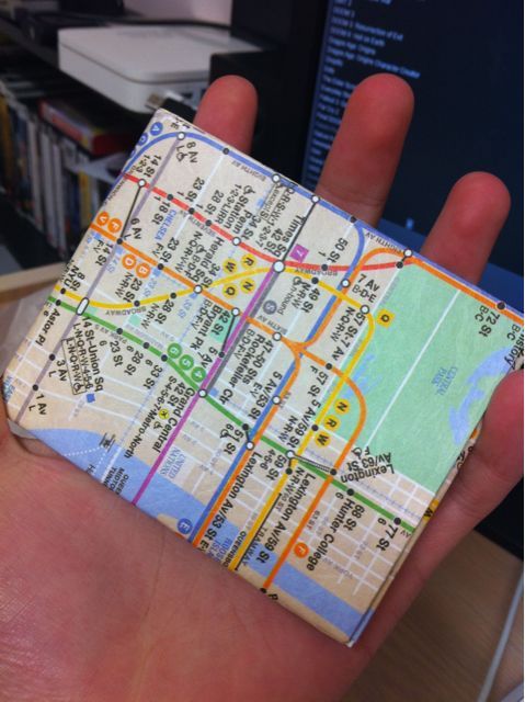
And return I did. I was back the very next day before Uni, and picked up the wallet with the NYC subway map. It’s like having a wallet without actually having a wallet. It’s (somewhat) unique. It’s only a single-fold, but that’s okay, I’ll get used to it.
I like it – I’m still tossing up whether I should give that extra bit of personalisation with an Apple sticker (as seen below), as doing so would mean that some of the map is covered up. We’ll see.
Bookmarks Clearout, Part I
Few of my bookmarks I had long since forgotten about (warning: most of these are pretty old). I’ll assume these were for blogging, so here you are, in no particular order:
- Portal on the iPhone
- Killer accessories for your guns
- Pac Man Stapler
- What is the best programming language for web development and why?
- The Typography Manual
- Expanding shipping material protects PC components
- Dating girls that smoke
- Photo and diagram of the world’s first ethernet cable
- NASA tape over footage of Apollo 11 landing on the moon
- Periodic table of awesomnets
- Cool watch
- How to guess the number of items in any jar
- Cool notepad
Here ends the bookmarks.
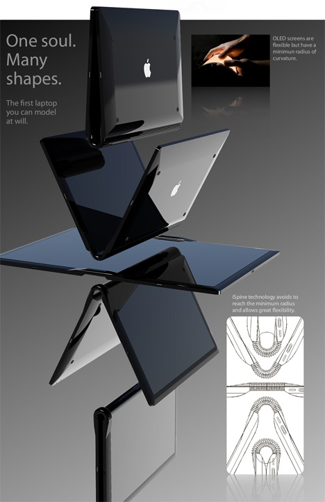
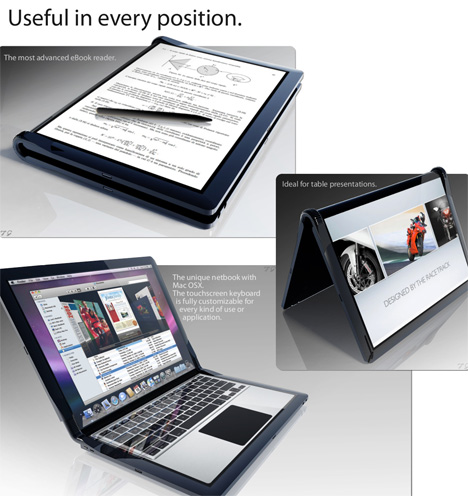
MacBook Touch by Tommaso Gecchelin
Designer Tommaso Gecchelin isn’t oblivious to all the rumors surrounding a netbook or tablet-like PC made by our favorite fruit manufacturer. We try not to indulge in rumors here at YD but sometimes they do provide fuel for inspiration, such is the case with this MacBook Touch.
via MacBook Touch by Tommaso Gecchelin » Yanko Design.
Ooh, shiny.
The Great CPU Caper – Intermission (Alternate title: WTF, Intel.)
For the first post in this series, see The Great CPU Caper, Part I here.
Like every good geek, I did some research before buying my E8400.
What I found wasn’t pretty – apparently, Intel changed the reference design of the stock heatsink/fan that came with every CPU that they sold.
The pictures speak for themselves, so I’ll let them do the talking:

The HSF on the left is from my E8400. Note how it does not have a copper core or base, and how it is half the height difference of the HSF on the right, which I presume is from a previous-generation of Intel CPUs, such as the E6600 or similar.
This is bad for two reasons – copper is a far better conductor of heat than aluminium is. The second reason is that by halving the heatsink module, they’ve essentially halved the surface area that will contribute to the dissipation of heat produced by the HSF.