Tag Archives: infographics

Left vs Right | Information Is Beautiful

Left vs Right

A concept-map exploring the Left vs Right political spectrum. A collaboration between David McCandless and information artist Stefanie Posavec, taken from my book The Visual Miscellaneum (out Nov 10th).

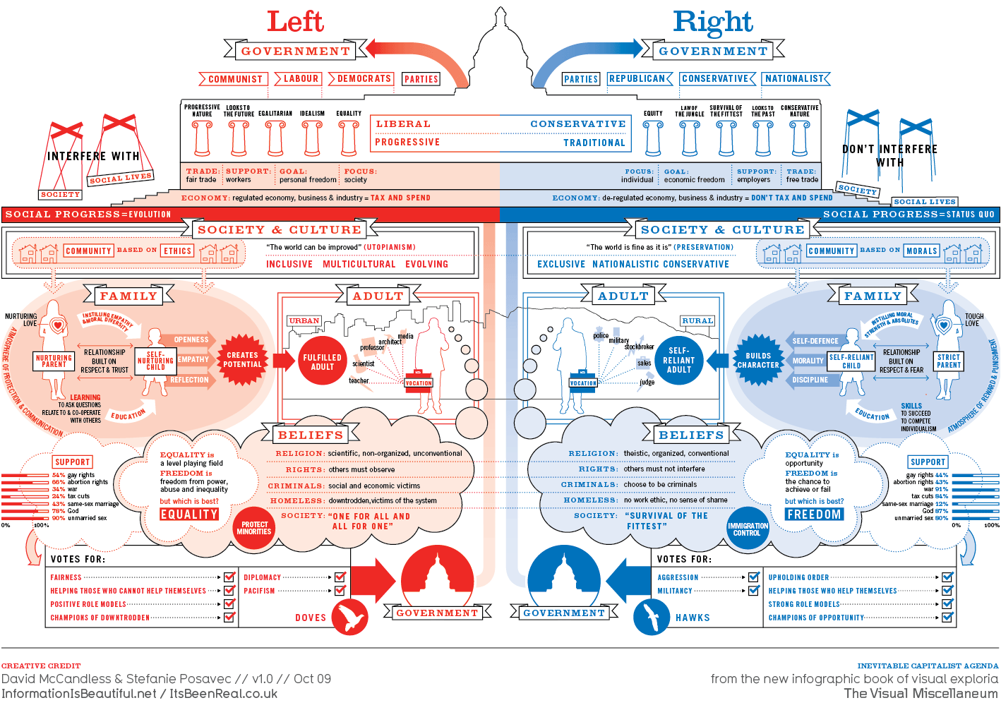
via Left vs Right | Information Is Beautiful.

Click to embiggen.

I’ll admit that it was this diagram that finally made me understand the difference between right and left wing politics.

Not that I’ve ever been that interested – I’m not your most faithful West Wing fan – but it’s one of those things everyone should know.

This post part of Blogtober 2009. We’re pretty much there.

The Billion Dollar Gram

billion dollar gram

via The Billion Dollar Gram | Information Is Beautiful.

Click to embiggen, and you’ll find out that the internet porn industry is worth $97 billion dollars. At least, I think it’s a billion. Could possibly be a million. Or something.

In any case, $97 billion dollars is bigger than Facebook (at a paltry $15 billion), the video games industry ($32 billion), Bill Gates ($46 billion), bigger than enough food to feed every child in the world for a year ($54 billion), even bigger than China’s defence budget ($60 billion)!

Surprising, no?

Now THAT’S creative! (Resume Infographics)

infographics resume

Many people ask me advice about their portfolio and CV and I always tell them to be creative to stand out of the crowd. This doesn’t apply to all kind of jobs, but when you’re talking about creative jobs, there are simply no rules on how to present yourself.

Don’t mention the name of your kindergarden school, don’t mention you’ve been working at McDonalds during summer break. Believe me, nobody cares. And if your future employer does care, then he’ll select you on the wrong criteria. You don’t want to work for such a company.

So get creative and make something awesome from your portfolio. Take the above portfolio as an example. Michael doesn’t show any of its works and still he succeeds in showing off his talent. Not only he can create great graphics, he also proves to be able to turn ‘boring’ facts and figures into something exciting. Well done Michael!

via Resume infographic on Flickr – Photo Sharing!.

Now THAT’S creative.

Click on the image for the full sized version.