Tag Archives: apps

My iPhone 11 Pro Home Screen

It’s been three long years since I last had a new iPhone. While my iPhone 11 Pro remains a best-in-class smartphone that would undoubtedly serve me well for at least another couple of years, it’s time to move on.

But before we can do that, I kind of need to break down the apps that are currently on my iPhone 11 Pro home screen. For posterity’s sake, if nothing else, but mainly so I can look back on this one day and reflect fondly on the interfaces and design paradigms of the era, for a time in the not-too-distant future when we’re all using augmented reality interfaces.

I’m writing most of this while waiting for the delivery of my iPhone 14 Pro. I should have had it delivered to work and had someone else sign for it, because the worst part of having it delivered to your home address is needing to be listening intently for a knock at your door, or if you live in an apartment building like I do, the ringing of your wall phone to indicate someone has called your apartment from the outside. Now I’m stuck here at 6pm like some kind of hostage, waiting for a delivery that would ordinarily, on any other day, have been here already. But maybe there’s lots of iPhones on the StarTrack truck today, so the deliveries are taking a little longer than normal.1

In the future I think if I’m not getting my iPhone delivered to work, I’ll probably pre-order it for in-store pickup. If I take the day off work I can take it slow, pick it up from the store first thing in the morning, and then spend the rest of the day transferring all my stuff. Maybe taking the single day of annual leave is worth it.

It’s been a long time since my last iPhone home screen post. The iPhone X launched in 2017 to much fanfare because it was the biggest change to the iPhone silhouette in the entire history of the iPhone. The distinctive top and bottom bezels were gone, replaced by an almost uninterrupted edge-to-edge display that had a small notch at the top. The home button that had long contained a fingerprint Touch ID sensor was replaced with an upgraded front-facing camera system and biometric unlocking system called Face ID, which shone a pattern of infrared LEDs into your face so you could be recognised by your phone. Combined with an all-new gesture-based navigation system and an OLED display with curved corners that touched every edge on the front of the device, it was the future of iPhones for years to come.

The iPhone 11 Pro wasn’t that much different to the iPhone X in terms of the screen. Apple added an ultra-wide camera to the back, and spec-bumped just about every spec they could across the board, and that was about it.

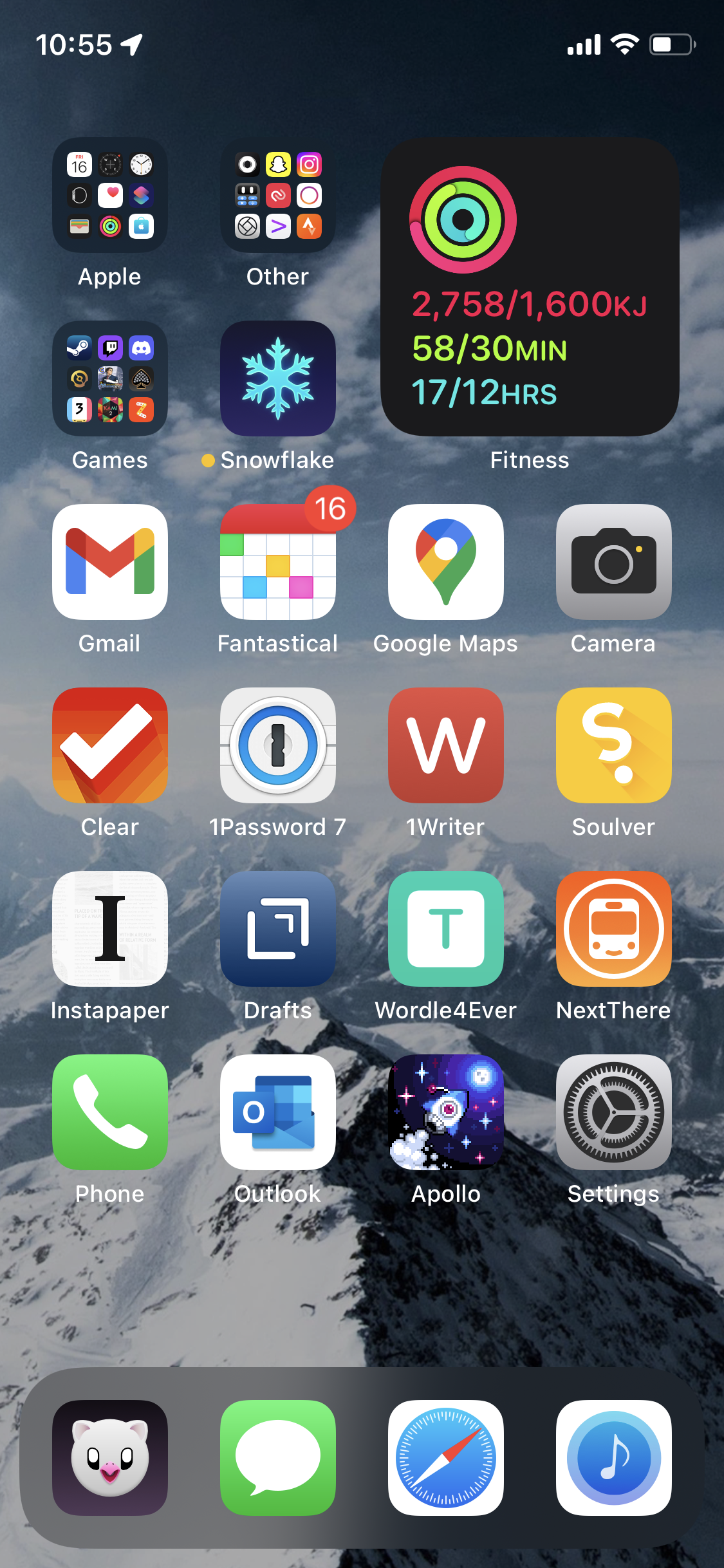
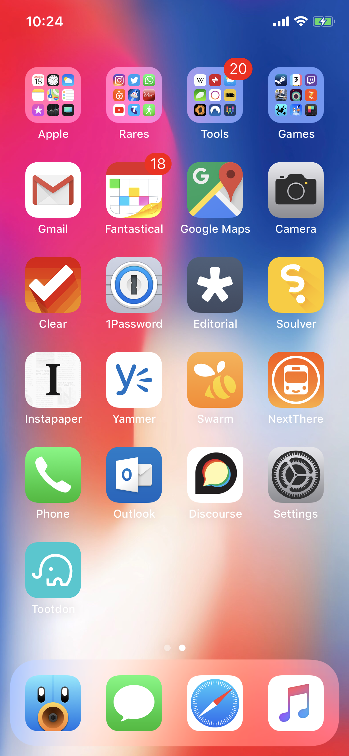
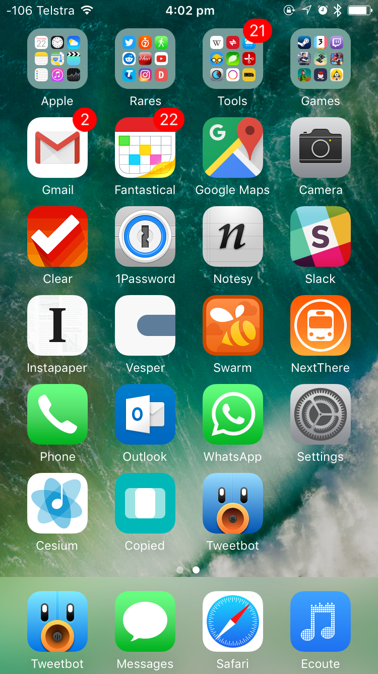
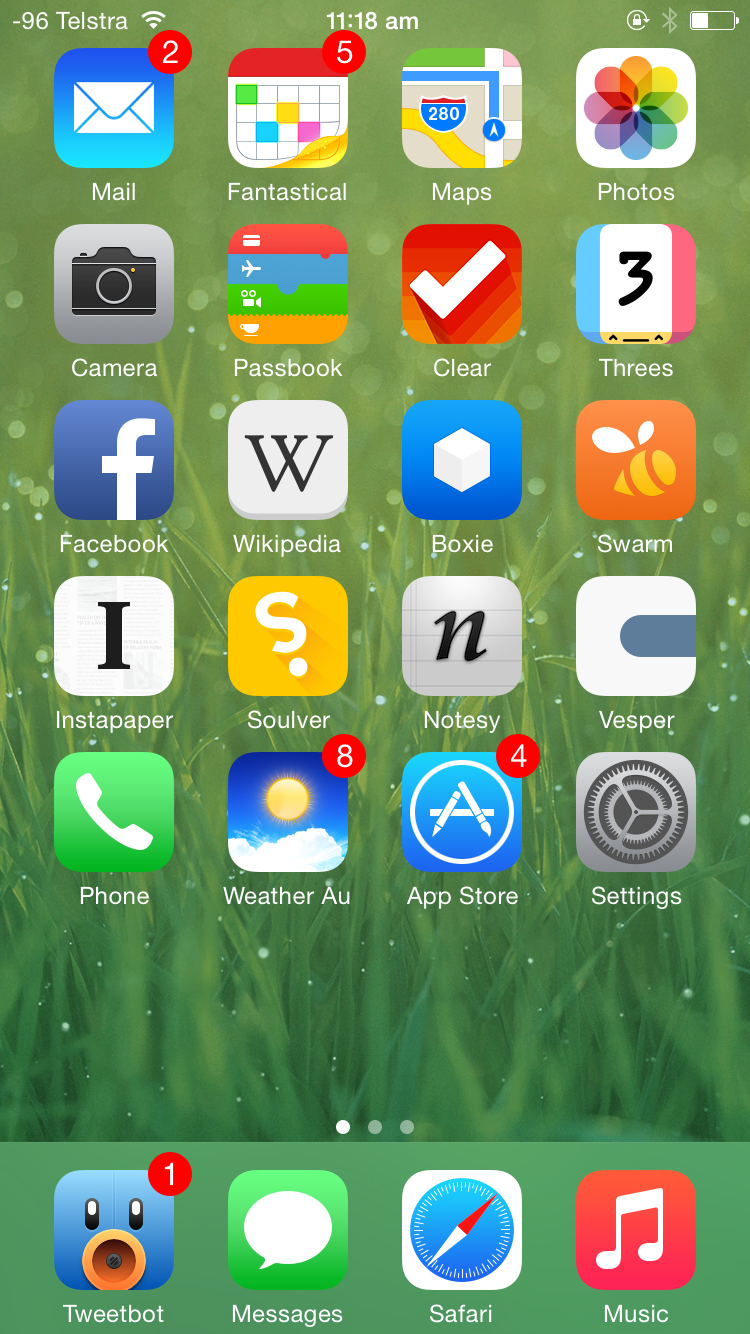
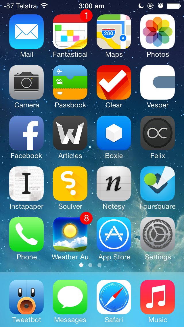
Which might be why, although my home screen looks a little different, my apps stayed more or less the same.

Once upon a time choosing what apps to put on your home screen was a challenge because there were so many apps and only a 5×4 grid to put them in. There might be more and better quality apps now, but because we have folders and search, deliberately choosing which apps go on your Home Screen, versus those that are relegated to a folder, or worse, the App Library, remains as much of a challenge now as it was then, even if it’s for different reasons.

I’m still using a modified CGP Grey home screen organisation method, although the only tenet I choose to adhere to is “only one page of apps”. With some mental gymnastics I can claim to have a free row, although I definitely have four apps in my dock. The dock’s real estate is too important not to, but for big screen phone reasons, not because it’s the one row that stays static over multiple pages of apps, because the latter isn’t something that I have to consider when I only have one page of apps anyway.

Speaking of which, let’s get into the apps.

Continue Reading →

My iPhone X Home Screen

It’s 6am. A frankly unbelievable hour. Nevertheless, I’ve caught the earliest bus I can tolerate, all in the hopes I’ll be able to pick up an iPhone X from one of the three Apple stores in the greater Brisbane region. I’ve chosen Chermside as my go-to — hopefully it’s a little less busy because it’s a little more out of the way, even though the Brisbane CBD store is easier to get to.

It’s not that I forgot to pre-order the iPhone X, it’s just that I wasn’t sure I wanted one. I wasn’t sure then, and I’m still not sure I want one now. But I might as well try. By the time I arrive at Chermside, the queue is maybe 40-something deep. The Westfield is eerily quiet at this time of the morning, but it’s nice. Peaceful, even.

I end up lining up for the iPhone X. It’s the second time I’ve ever lined up for any iPhone. I put in a reservation with the Apple blue shirts when they start working their way through the queue at around 7am, who congratulate me on my new iPhone once we’re finished choosing. The store opens at 8am, but it’s still about another hour after that I get to purchase my iPhone X. Was it worth it? Absolutely.

You probably saw where this was going when I started writing about my iPhone 6 and 7 home screens, years after those devices were released. I thought we needed some kind of catch-up before getting to today’s iPhone X home screen.

Given that it’s only been a year since the iPhone 7 was released, not much on my home screen has changed. I’m still using a home screen organisation method that’s similar to the CGP Grey method, and only a few apps have been swapped out.

Starting from the top:

  • Notesy has been switched out for Editorial, as the former has been removed from the App Store. They’re both pretty similar apps, even if Editorial has a bunch of powerful workflow-type actions that I’ll probably never use.

  • Slack was relegated to a folder after I discovered I wasn’t using it as much as I wanted to be, and Soulver makes a return to the home screen in its place.

  • Vesper was also removed from the App Store and my home screen. I’ve got Yammer in its place, because I’m now a corporate drone and a slave to the man.

  • WhatsApp was moved to a folder because I hardly use that either, and the Discourse app lets me check AppleTalk without having to load up Safari, even if it is just a glorified web wrapper.

  • Ecoute was moved into a folder because it’s hard to beat the inbuilt Music app when I’m an Apple Music subscriber. To be fair, Ecoute still works with iCloud Music Library, but the built-in Music app has Apple Music integrations that aren’t available on third party apps. I’m also using a manual playlist for the “play all music from playlists within a folder” problem that I described as one of my main reasons for using something other than Music originally.

  • Tootdon is on my home screen at the moment because I’m trying out Mastodon as an alternative to Twitter. Mastodon feels a lot like App.Net right now, but we’ll see how it all pans out.

It’s been two weeks since the release of the iPhone X, and so far, Gmail, Google Maps, Clear, Editorial, Soulver, and Discourse don’t support the larger iPhone X screen. I’m kind of surprised Google’s apps aren’t updated, I can understand why Clear hasn’t (they’re apparently working on a complete overhaul, but the app was very custom to begin with), but apps like Editorial, Soulver, and Discourse are a little behind. Discourse is particularly puzzling, given that it looks like just a super-barebones web wrapper that you wouldn’t think has much custom code.

But there’s another problem with the iPhone X that’s just as important as non-optimised apps: it’s almost impossible to find great wallpapers for it. Even if you do manage to find something with the right resolution and the right aspect ratio, the quality of the screen means you’ll quickly notice any imperfections. Thankfully, a few recent Samsung devices (the S8, S8+, Note 8, and slightly older Note 4) all have displays with similar aspect ratios. If you can tolerate a slightly zoomed wallpaper, then there’s a whole range of 2560×1440 wallpapers that you can find. I’ve also been using Vellum.

My iPhone 7 Home Screen

For the first time since the iPhone 4 was released, the iPhone 7 introduced no changes to screen size over the previous model (notwithstanding S-revisions). But sometime during the two years of the iPhone 6 and the iPhone 7, I switched to some variation of the CGP Grey method of home screen organisation, once again covered by Ben Brooks. There’s now just one page of apps, at least one row that has no apps at all, and four icons in the dock. Everything else goes in one of the folders.

The advantages of this method of home screen organisation make a lot of sense. The days of having pages and pages of apps were over since Apple introduced folders, and this takes that idea to the next level. No longer do you have to rely on muscle memory to remember which apps are where, and instead, you can rely on Spotlight to find the app you’re looking for. Letting go of any inclination to organise those top-row folders is also incredibly freeing.

Your most-used apps can still remain on your home screen, and with iOS 9 and the introduction of Spotlight suggestions, sometimes you don’t even have to search for the app you want, as it appears in your Spotlight app suggestions. If you’re thinking of adopting this method, I’d highly recommending hit “show more” within Spotlight to show eight app suggestions instead of the default four.

Unfortunately, this requirement for some folders and just one page of apps meant that I had to make some decisions about how many individual apps I had on my home screen. Thankfully, changes to usage patterns made that a little easier. This is going to get a little lengthy, but stick with me.

Let’s talk about what was removed, to start off with. If I was going to keep one of the Camera or Photos apps around, it was going to be Camera, as I could always access Photos from within Camera. The argument could also be made for removing Cameras, as you have shortcuts to it from the lock screen and Control Center, but I still wanted it on my home screen too. With a folder dedicated to games, off went Threes. Passbook, Facebook, and Wikipedia also went — not that I don’t find those apps useful, but I found I wasn’t using them enough to justify a now-scarce spot on my home screen. Once I realised I hardly used the App Store app for finding new apps or basically anything at all, that was also moved into a folder.

Pocket Weather Australia was moved into a folder, which initially proved to be a bit of a dilemma thanks to the fact that the CGP Grey method doesn’t work well with folder badges. Folders only have one badge that is the sum of all the badges on apps within it, and because I use Pocket Weather’s badge to tell me about the current “feels like” temperature, I had to turn off notification badges for every other app in the same folder. As it turns out, none of the apps in there have badges I care about anyway, so off went that switch.

Boxie fell victim to “internal team issues”, which meant that development ceased and the app was removed from the App Store and my home screen not too long after.

Exactly seven apps remain unchanged from my previous iPhone. Fantastical, Clear, Notesy, Instapaper, Vesper, Swarm, and Tweetbot remain the staples of my third-party iOS experience, all representing the best-in-class versions of their respective App Store categories. Tweetbot 4 had only recently been released, which is why I was running it in tandem with the old version until I had a chance to do something about my numerous written, but not tweeted, drafts.

Now, changes.

It was during the period between iPhones that I started a new job in a new city, which meant a work email account. Not wanting to cross the streams, I decided to ditch Mail in favour of Gmail for my personal email. This turned out to be a pretty good choice, as I gained push email and smarter notifications at the cost of not using the built-in mail client. Living in a new city also meant I needed the most accurate data possible for Maps, which meant swapping out Apple’s aesthetically-pleasing maps app in favour of Google’s more accurate one. The jury’s still out on which one I prefer.

Sick of Apple’s unending changes to the Music app which removed features I used, I was trialling Ecoute and Cesium as potential replacements for the default Music app. At the time this screenshot was taken, I had settled on Ecoute as I liked how it created a playlist from a folder of playlists containing all the songs within the folder.

Additions to the home screen this time around include:

  • 1Password — I think I added this because I wanted to focus more on using strong, unique passwords for online accounts. Owning multiple computers meant I was logging into those accounts multiple times, and because I haven’t ponied up for 1Password on multiple platforms, the iOS version is the next best thing as my iPhone is always with me. Which is a good thing, as the 1Password iOS app is great.

  • Slack — I’m not sure why this app is on my home screen. I’m a member of exactly one workspace, which hasn’t had a message in any of its channels in months. I could easily swap this out with something else, but for now, I enjoy the nerd cred that I get from having it there (even if I’m the only one that knows about it).

  • NextThere — A new city meant new, real-time public transport options, and that meant NextThere. No other public transport app comes close to the everyday convenience offered by NextThere when it comes to knowing the next train or bus departing from your closest station or bus stop. And besides, who doesn’t want a smiling bus on the their home screen?

  • Outlook — This is for work email only, although I’d prefer using it for Exchange and Office 365 email over the built-in Mail app. Something about a first-party app just makes me feel more comfortable about the reliability of the thing, you know?

  • WhatsApp — My permanent WhatsApp status says “I begrudgingly use WhatsApp. Please don’t message me here unless you really have to.” I really have no idea why this was on my home screen at the time of this screenshot.

  • Copied — With the demise of the iOS version of Pastebot and no replacement on the horizon, I wanted something capable of doing some iOS clipboard management. The need is largely negated now that iOS and macOS talk to each other and I can copy stuff between both operating systems, but having an on-device clipboard manager has still come in handy on occasions, especially when I’m trying to copy and paste between my iPhone and iPad.

The folders themselves are self-explanatory. I could delete most of the Apple apps now that that’s a thing you can do as of iOS 10, but I keep them around. There’s a bunch of apps in the Tools folder that I rarely touch, and even more apps within Rares that I use maybe a handful of times per year. Games tends to get a few new additions here and there, but for the most part that stays pretty static too.

The eagle-eyed among you will note that I’m not sticking completely to the CGP Grey method of home screen app organisation, because there’s three apps in the row that’s supposed to kept free. I’ve been using that row as a trialling ground of sorts — some apps stay there temporarily to encourage use while I give them a red hot go, and from there they’ll either get promoted to a folder, or if they’re particularly good, a coveted spot on the home screen.

And if they’re not that good, then it’s the little X for them.

My iPhone 6 Home Screen

The last time I did one of these was back in 2013 not too long after the iPhone 5 was released, so we’re definitely long overdue for an update on my home screen. I think it’s interesting how this kind of thing changes over time, either because apps stop getting updated, better alternatives come along, or my own usage patterns change. Either way, let’s get into the nitty gritty.

I don’t have a definitive screenshot of my very first iPhone 6 Home screen, but I think is the closest thing, and it’s certainly the only home screen screenshot from just after the iPhone 6 release back in September 2014. As you can see, not that much has changed from the iPhone 5 home screen: besides adding another row of apps, introducing a whole new dilemma for home screen icon organisation, I’m more or less using the same apps.

Old favourites Fantastical, Clear, Facebook, Boxie, Instapaper, Soulver, Notesy, Vesper, and Pocket Weather Australia all make a return, and Tweetbot retains its coveted number-one spot on the dock. This being a year after the introduction of iOS 7, most apps and their icons have made the jump to feature the divisive flat design.

Changes to apps between my iPhone 5 and iPhone 6 include swapping out the much-loved, but unfortunately no longer updated Articles for the surprisingly great official Wikipedia app, which has all the features I care about in a mobile Wikipedia interface. Following the developer joining Apple, Articles isn’t the first app that was abandoned, and it certainly won’t be the last to be swapped out for a more modern alternative.

The demise of App Dot Net also saw the removal of Felix from my home screen. A pity and a damn shame it’s no longer available in any shape or form, as I’d rate Felix in my top five iPhone apps of all time based on aesthetics and usability alone despite the fact it was tied to a promising, if ultimately doomed, social network.

Sometime in 2014, Foursquare decided to split its app into two. Foursquare became the app for place recommendations, while Swarm was the gamified version, the one you used to check into places and collect mayorships based on how many times you had been there recently. Because the mayorships and check-ins was the original reason I joined Foursquare, I decided to keep Swarm on my home screen. Foursquare was relegated to a folder.

Threes is the only game to feature on my home screen, but mostly because it’s perfect for the in-between moments that life sometimes gives you.

Note that I’m still using multiple pages of home screens, with single icons on the first home screen, some folders on the second, and mostly games on the third.

My iPhone 5, iOS 7 Home Screen

iphone 5 ios 7 home screen

Updated 1/11/13 for a few more iOS 7 app updates

It’s been a year since the last time I wrote one of these, so I figured it was about time I updated the previous post with everything that’s changed during that time.

IOS 7 brought a massive list of changes, first and foremost of which was a massive overhaul of how everything looks and feels. Some people absolutely hate it, but I like it, for the most part — it makes everything fun.

Anyway, let’s talk about some apps.

Continue Reading →

My iPhone 5 Home Screen

It’s been a while since I last wrote one of these things, and after reading about how good the Windows Phone 8 home screen is (and the story of how it came to be), I realised even though this kinda thing only interests a handful of people, it’s still interesting to me.

So here goes.

My previous iPhone homescreens were organised according to what I’m calling a “loose Ben Brooks configuration”, that is, one based loosely upon the methodology upon which Ben Brooks organises his homescreen. The iPhone 5 introduces a new dilemma in this regard, which Ben has also covered, but I’ve come up with my own spin on things. Instead of not using the very top row (which Apple’s new human interface guides says not to bother about, UI wise), I’ve simply added an extra row somewhere in the middle. Why? Because it’s really not that much of an issue being able to reach the entirety of the iPhone 5 display — even when using it one handed — like Apple’s “Thumb” ad shows.

Anyway, to the apps:

First row: Mail, Tempus, Maps, Photos

Tempus now occupies the position previously occupied by Calvetica. It’s a calendar replacement by the same developers, but somewhere along the way, I fell out of love with Calvetica. While it was still a great calendar replacement, it wasn’t the same app it originally was, something even the developers themselves admitted. Tempus is the minimalist calendar replacement I’ve wanted — but it has to be noted this is the only app on my homescreen that doesn’t support the taller iPhone 5 display. The developers say it’s coming “in the future“.

Also  notable is the Apple Maps app, instead of the great Maps+ replacement. I want to like Apple’s maps in iOS 6 because they’re superior in a number of ways (vectorised maps, much lower data usage, heaps of caching), and this is my way of doing so. For the record, Maps+ is just a small swipe-towards-the-left away, if and when I run into any issues.

Second row: Camera, Clock, Passbook, Clear

Passbook is here because I’m a big fan of the concept — if only more retailers would jump on board, it would likely be on your own homescreen, too.

Clear is here because it’s my go-to for doing short lists, fast. The completely gestural interface is insanely brilliant, and I enjoy it a lot — it’s a great app for making short lists very quickly. I don’t use it for actual reminders (because I’ve got Reminders for that), but it is useful for short lists: to-dos, shopping lists, games I want to buy, and so on.

Third row: Facebook, Articles, Dropbox, Felix

Facebook was one of the apps “promoted” from the second homescreen to the first, thanks to the four extra apps I can have on the first homescreen. I don’t use it as much as, say, Tweetbot, but it’s still there when I need it to be.

Articles for reformatted Wikipedia articles, and Dropbox for accessing my Dropbox documents when I’m out and about.

Felix is one of the better App.net clients out there — you know, that semi-exclusive social network that popped up recently. By nerds, for nerds. Netbot could just as easily be occupying this position, but Felix has Helvetica Neue on its side.

Fourth row: Instapaper, Soulver, Notesy, Foursquare

Instapaper continues to be the best way to read later and Soulver remains the best calculator.

Notsey takes over from Elements as my Markdown-enabled, Dropbox-syncing plain text editor of choice — it doesn’t use Museo Sans like Elements does, but I was sick of the error messages Elements would frequently pop up. Notesy is perhaps a touch more customistable than Elements is, but otherwise, they’re pretty much the same app.

Foursquare was also one of the promoted apps from the second homescreen.

Fifth row: Phone, Pocket Weather Australia, App Store, Settings

Pocket Weather Australia (a.k.a. Weather Au) is the best weather app for Australians, period. After languishing in a folder in the second page for too long, it now gains a spot on the homescreen — with the “feels like” temperature for my current location as the icon badge constantly updated. It’s an insanely beautiful app that’s also available on Android, if you’re so inclined.

Dock: Tweetbot, Messages, Safari, Music

Tweetbot is among the few apps that mean I won’t be leaving the iOS platform any time soon. I’ve never seen an Android app that even comes close to the quality of Tweetbot, and it’s unique in that it’s perhaps one of the only apps that actually deserves a place on the dock. It’s amazingly good. Oh, and I occasionally use it for Twitter, too.

I still mourn the loss of the iPod app.

Miscellaneous

I’m actually using one of the default background wallpapers. Apple has done an amazing job picking out the default wallpapers that come with iOS 6 — a few are flashy, yes, but the rest are beautifully subtle, two-tone affairs suitable for use on both the lockscreen and the homescreen.

If you want to enable the numeric signal strength without jailbreaking, follow these instructions.

Don’t tell me it isn’t about the apps! (It is.)

I’m sitting here, thinking about the final touches of my ultra-mega Android wrap-up post, chilling out with Katy (Perry), and I realise, now more than ever, that it’s about the apps.

It’s always been about the apps.

Not about how many there are, or how many are fart apps, or or how many spam apps there are. None of that. It’s about the apps that you’ll use — yes, the platform matters, but the apps you’ll be using on a daily basis matter even more.

Looking back at my Android experience, not one app has been compelling enough for me to go “whoa, this is really cool!”. Not an app that I’d use daily, anyway. I mean, there’s a limit to how impressed you can be by a screenshot app, even if it is one of the best things about your Android device. Launcher Pro is great and all, but I’m relegating that to the domain of “a very nice advantage of Android” rather than anything else.

I mean, even Windows Phone 7 had the excellent 4th and Mayor Foursquare app. That was seriously good. I probably wouldn’t switch to WP7 purely for that app, but it would be a damn compelling reason to.

It’s apps like Tweebot that keep me on iOS. Apps like Instapaper. Elements. Verbs. Articles. See what I mean? I might not use some of these apps every single day, but the very fact that they’re on my device, ready for whenever and wherever my fingers need them to go, that’s what matters the most.

As much as the overall platform matters to the “bigger picture” — it’s about the apps, man. If there aren’t any really good apps in your App Store, Marketplace, or App Catalog — you better hope your web browser and email client is up to scratch.

Buy the apps outright, full-price, directly from the developer.

It’s not a bargain if you don’t need it.

Let’s just say there is one of these bundles – lets just call it MacTheft – and the price for eleven apps is $19.95. And, let’s just say they promise to give $5.00 of your purchase to starving children in cataclysmicly devastated regions of the world. Therefore, the price of the software – all eleven apps – is theoretically $14.95. But, let’s just say there is only two apps out of the eleven that you really think you need. Here is a crazy idea to try…

Buy the apps outright, full-price, directly from the developer.

Crazy, right?

[…]

OK, fine. You want a “bargain”. How about this… Contact the developers of the two apps you want and say something like…

“Hey, I see you have your apps available on MacTheft and, while that is great and all, I really don’t need all eleven of them. I really only need two, your’s and this other guy’s. Therefore, I am contacting each of you to see if I could give you $7.50 cents directly. I figure that is about 10 times more than you will get from my individual sale if I buy it through MacTheft. Also, I was planing on giving five dollars to the starving children too.”

via Minimal Mac.

Minimal Mac is, of course, talking about the recent MacHeist nanoBundle which contained heaps of pretty cool apps for the bargain-basement price of just $20.

I wasn’t going to buy the bundle at first, but then Tweetie (the super-mega-awesome Twitter client for Mac) came along, and I figured I might as well buy it for Tweetie, and get the rest of the apps for free (which were valued at over $260 if bought separately). Here’s hoping I actually get around to using RapidWeaver one of these days…

In hindsight after reading the above article I should have really bought Tweetie separately (the few-and-far between ads are so awesome I have them turned on anyway, haha), but the clincher this time was that there was some sort of “public beta” access to Tweetie 2 for Mac – a pretty big deal as 2.0 has been a long time coming, and will probably feature all those cool Twitter features the iPhone version of Tweetie has had for the past couple of months.

The thing is, had I bought Tweetie directly from the developer all those months ago, there’s absolutely no obligation for the developer to come along and say “hey, thanks for purchasing our app, we’ll get in touch when we need beta testers for the next version”. By buying Tweetie from MacHeist, not only did I get into some privileged beta program (along with every other purchaser), but I also got a whole lot of other apps for, what is essentially free. Where’s the loser here? The developers of the other programs? They gain some publicity. The charity who received the 25% donation? Well, any money’s better than no money. Me? I “paid” for an app I use constantly, and got some more apps for free. Who then, is the loser here?

Don’t get me wrong, I’m not against schemes like MacHeist. They’re a great way to get some HUGE publicity for your app – had you asked me a year ago what ShoveBox was, I wouldn’t have been able to tell you. Same for pretty much every other app that came included in last year’s MacHeist bundle, and same again for this year’s nanoBundle. Ambrosia Software recenltly had a pretty good sale as well – I’ve been looking to pick up a copy of EV Nova for a while now, and they had it in a bundle with some other apps. The only catch was, it was the Windows-only version. Ambrosia make some cool Mac stuff and EV Nova is available for Mac as well – so I didn’t end up buying that particular bundle that time around. Just a month or so ago however, I picked up EV Nova from their website, at full retail, and as a result, got both the Mac and PC versions for the same price, similar to what Valve will be doing when they release Steam for Mac sometime later this year.

Yeah, I know I’ll probably never use some of those applications, but the thing is, other people might. I know I’ll almost never need to use a clipboard manager under OSX, but other people might – now that Clips was included in MacHeist, I can now recommend it to other people to try out. Sure, the couple of people I tell in my lifetime that buy Clips for the full price probably won’t make up for the 50,000 or so people who bought Clips for nothing, but even if every person managed to on-sell just one copy, that’s an additional 50,000 copies they probably wouldn’t have sold. I know I’m not taking into consideration things like support costs and all that, but do you kinda see my point?

That being said, if developers actually offered decent discounts (25% or more) on some of their apps, I can certainly see myself buying software more often. Hell, Panic held a sale with 50% off all their software last year, and I picked up Transmit because it was a frequently used app of mine. I wish I picked up Coda at the same time, but I know I’d almost never use it. So, to Cultured Code, Panic, Ambrosia, and all those other software developers that make cool stuff – have sales. You’d be surprised how many people will buy your stuff if it’s priced decently.

That’s how I’m going to justify it to myself, anyway. Your mileage may differ, but here’s hoping you got something out of this. mini-rant.

Now for Some Music

now for some music

via YMFY.

I’m not usually one to buy my music (unless it’s free, thanks for the coupons @Mac1), so this fits perfectly with my modus operandi.

However, stealing is bad. While I won’t go out of my way to buy things that I can easily steal (music, software), I’ll usually endeavour to buy those things that I can’t easily steal (hardware, things I can touch etc), as well as those things that I use or enjoy on a frequent basis – software from awesome Mac developers Panic is a great example, as is music from Dream Theater (iTMS Link).

30+ Amazing Mac Apps for Developers

Saying that Transmit is a superb FTP program for Mac would be an extreme understatement. Just look at all the features of the program on their homepage, there are far too many to list here. If you are looking for a high quality FTP program for Mac, Transmit is a great choice.

via 30+ Amazing Mac Apps for Developers | Website Design Blog.

Transmit is an excellent program – and this website gets the website of the week award.